


Pedtal
Logo Design
Cycle Experience
This e-bike experience company, was searching for a name and logo that felt lively, outdoorsy and friendly. They will be offering local self guided tours, and through their branding, wanted to showcase their care for the environment, and their adventurous biking spirit.


Name
With the intent of giving this e-bike company an outdoorsy, active and joy filled feel, we were thrilled to land on the name “Pedtal.” Pedtal is a blend of the words pedal and petal, symbolizing the beauty of the outdoors and a more literal mention of a biking element. This name felt perfect for the endeavor, and offered a wonderful logo opportunity, we were excited to explore.
Color
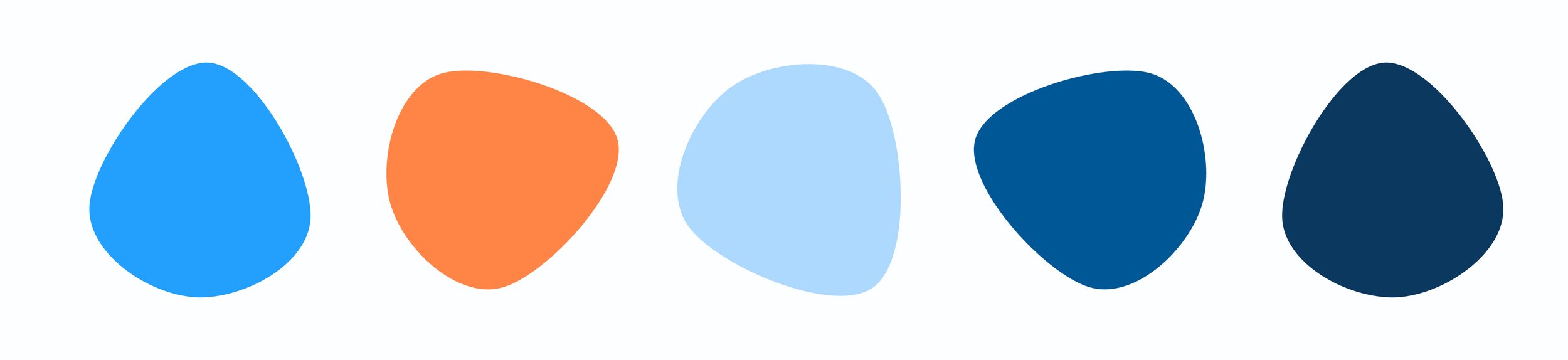
The colors chosen for Pedtal are bright and complimentary. They convey an active and summery feel.


Symbol
The Pedtal symbol is a mix between a flower and a bike pedal. The symbol unites two different, similar sounding elements; pedals and petals. The two elements are visually blended in this symbol, and create a punny, outdoorsy and active mark.

Wrap Up
This was an incredibly fun project to work on. This logo met all of the original intents of the project and will pedtal alongside the growth of this brand. We’re excited to see Pedtal launch.