


Brand Identity for
Pedtal Cycle Experience
Role: Graphic Design Studio
Client: Conceptual Cycle Experience Company
Projects: Logo, Branding
This was a 2020 project. One of those random ideas that entered my brain mid-pandemic. In an effort to get outside and keep things lively during an unpredictable time, this conceptual e-bike experience company brand came to life.
The idea was this. A local, self guided, electric bike touring and experience company. You’d rent a bike, get a map with a few local shop destinations, and end your adventure at the park, where you’d eat the complimentary lunch already packed in your bike basket.
I named it Pedtal. “Pedal” and “Petal” combined. And before you go booking your experience, the company unfortunately never launched. But the branding did! This brand is available for Sale. Contact for Pricing.

Concept Mockup
With the intent of giving this e-bike company an outdoorsy, active and joy filled feel, we were thrilled to land on the name “Pedtal.” Pedtal is a blend of the words pedal and petal, symbolizing the beauty of the outdoors and a more literal mention of a biking element. This name felt perfect for the endeavor, and offered a wonderful logo opportunity.
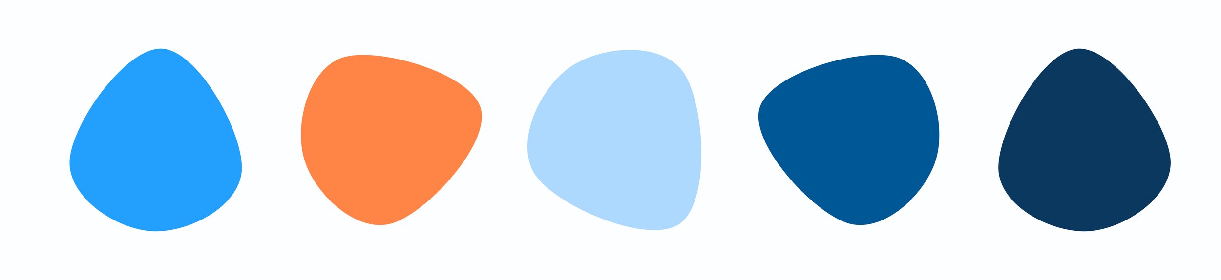
Color Palette
The colors chosen for Pedtal are bright and complimentary. They convey an active and summery feel.


Logo & Symbol
The Pedtal symbol is a mix between a flower and a bike pedal. The symbol unites two different, similar sounding elements; pedals and petals. The two elements are visually blended in this symbol, and create a punny, outdoorsy and active mark.

Wrap Up
This was an incredibly fun project to work on. This logo met all of the original intents of the project and will pedtal alongside the growth of this brand. We’re excited to see Pedtal launch.